Very much like the physical movements of the earth around fault lines, the tectonic plate-like upheavals of different peoples around the globe have also caused both fears and concerns centering around impacts, both positive and negative, on the different "plates" or regions of the world.
Europe mulls over its growing Muslim populations which have grown exponentially during the last three decades, creating many fissures or enclaves of splintered parts exerting social and political pressures and sore points within the different citizenries. The population components in countries like Holland have shifted considerably because of immigration and in Paris, certain areas are now off-limits to certain authorities such as the police due to pressures exerted by their largely unassimilated minority populations.
And the US is no stranger to such cataclysmic tremors, maybe as a consequence of its very liberal policies on immigration, or very lax enforcement of immigration laws. The US Senate is now locked in heated discourses about a pending a immigration bill that addresses the over 11 million illegal immigrants who reside within its borders and over 75% of whom come from Mexico and Latin American countries, with more being added each day as the porous southern borders continue to be largely neglected.
Taking a macro view then of all these
temblors, one may be able to take a much more rounded and detached view of how this "pale blue dot" looks given all these upheavals.
One such site looks at all these people movements and plots how these shifts are remapping and realigning the different regional "plates". It is the
WorldMapper.
Take a little time to find out how the globe now looks because of the world-wide emigration, people departing from their places of origins, and the resulting immigration of people getting into new areas.
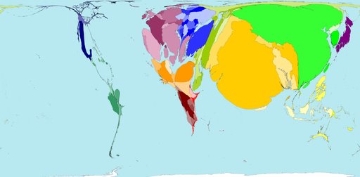
First, take a look at the
Total Land Area in the globe.
Each territory's size on the map is drawn according to its land area:

The total land area of these 200 territories is 13,056 million hectares. Divided up equally that would be 2.1 hectares for each person. A hectare is 100 metres by 100 metres.
However, population is not evenly spread: Australia's land area is 21 times bigger than Japan's, but Japan's population is more than six times bigger than Australia's.
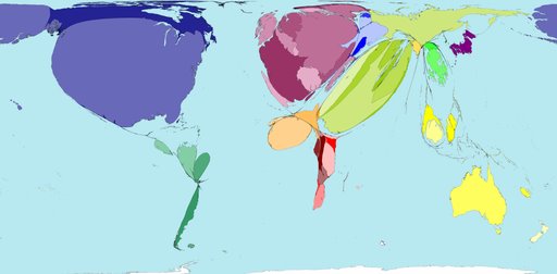
Second Map:
Total World Population
The size of each territory shows the relative proportion of the world's population living there.

In Spring 2000 world population estimates reached 6 billion; that is 6 thousand million. The distribution of the earth's population is shown in this map.India, China and Japan appear large on the map because they have large populations. Panama, Namibia and Guinea-Bissau have small populations so are barely visible on the map.
Population is very weakly related to land area. However, Sudan which is geographically the largest country in Africa, has a smaller population than Nigeria, Egypt, Ethiopia, Democratic Republic of Congo, South Africa and Tanzania
Third Map:
Total Population During Year One
This map shows the distribution of the world population in 1AD

The population two thousand years ago is estimated to have been 231 million. At this time North and South America were sparsely populated, as was Asia Pacific. The estimated population of New Zealand was zero. Southern Asia, Northern Africa, China and Southern Europe (parts of the same land mass) had relatively high populations.
Colder Northern latitudes tended to have lower populations.
The territories that now encompass the Ganges, Tigris, Yangtze, Nile and Po rivers were the most populous.
Fourth Map:
Total Immigrants
The territory size shows the number of international immigrants that live there.
Three percent of the world population in 2000 were born in a territory different to where they now live: one hundred and seventy-four million people have moved to a new territory.
The United States receives the highest number of international immigrants (people born in another territory and no longer resident there); however Andorra has highest proportion of immigrants living within its borders. Four out of every five people in Andorra are international immigrants.
In the Philippines and Guyana, territories experiencing some of the lowest immigration, only one person in every 500 is an international immigrant.
Fifth Map:
International Emigrants
Territory size shows the number of international emigrants originating there.

This map shows the proportion of the world's international emigrants coming from each territory. This map indicates that the worldwide spread of origins is not dominated by any single region. Nevertheless variations exist.
Regional averages for the percentage of the population that emigrate range from one percent of the population in Southern Asia, Eastern Asia and Japan, to eight percent in Eastern Europe and nine percent in the Middle East.
Sixth Map:
Net Immigration
Territory size shows the relative levels of net immigration in all territories (immigration less emigration).

Richer territories tend to experience net immigration (greater immigration than emigration). Just under half of the 200 territories mapped currently experience net immigration. Those territories with net emigration (greater emigration than immigration) have size zero on this map.
Regions experiencing the highest net immigration are North America, Western Europe and the Middle East. Together these three regions account for 79.5% of world net immigration. The United States alone receives 37.1% of the world net total.
Seventh Map:
Net Emigration
Territory size shows the relative quantity of net emigration in all territories (emigration less immigration).

Over half of the territories in the world are currently experiencing net emigration. More people are leaving them than are coming to them.
Territories with net emigration generally are poorer than those with net immigration. Mexico is the country with the highest net emigration, with a net loss of 8.8 million people in 2000. Mexico is in North America, the region whose territories have the largest net immigration.
The United State's high immigration rate is linked to Mexican emigration. Were the United States and Mexico combined to be one territory then this movement of people would not be recorded as immigration nor emigration.
Visit the
site, there are more maps, such as relating to tourism, projections of population growth, etc.
Gives one a more comprehensive and global outlook.